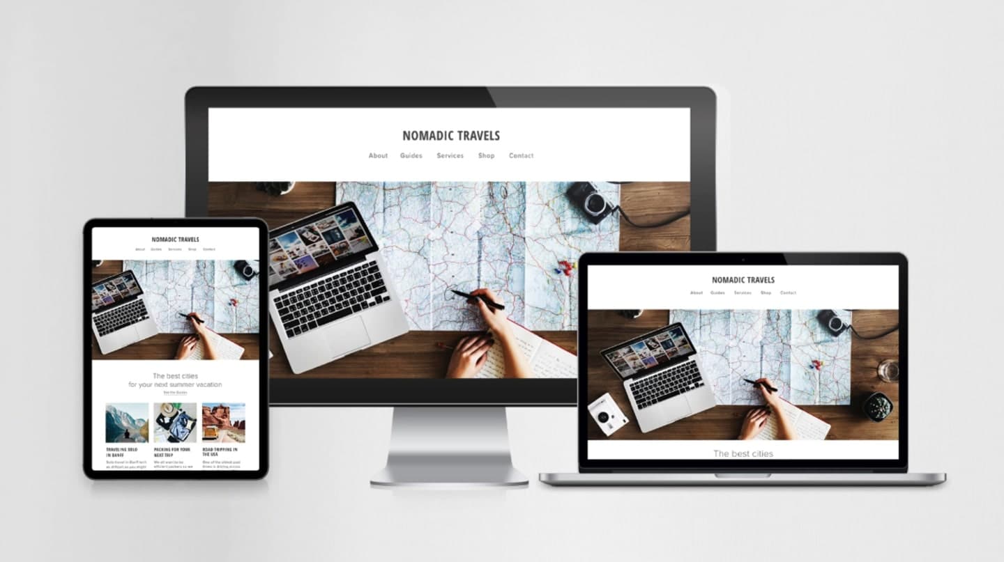
n today’s digital world, users access websites from multiple devices—smartphones, tablets, desktops, and beyond. That’s why responsive website design is crucial. We build websites that adjust effortlessly to any screen size, ensuring a smooth, consistent, and engaging experience for every visitor.
What is Responsive Website Design?
Responsive website design allows your site to automatically adapt to various screen sizes and resolutions. From compact smartphones to large desktop monitors, your website will maintain a visually appealing layout and seamless functionality across all devices.
Why Choose Responsive Design?
Responsive design is no longer optional—it’s essential for businesses aiming to stay competitive online. Here’s why it matters:
Enhanced User Experience: Your visitors benefit from easy navigation and clear, readable content across all devices, ensuring a seamless browsing experience.
Improved SEO Rankings: Mobile-friendly and responsive websites are favored by search engines like Google, helping boost your visibility and search rankings.
Cost-Efficiency: A single responsive website eliminates the need for separate versions for different devices, saving time and development costs.
Increased Engagement: Users are more likely to stay longer and interact with a website that looks appealing and functions smoothly on any device.
Our Responsive Design Features:
We incorporate a range of features to ensure your website delivers a seamless, adaptable, and engaging experience across all devices.
Features We Offer
Our responsive websites come equipped with advanced features designed to enhance usability, performance, and user engagement across all devices.
Industries We Serve:
We provide responsive website solutions for a wide range of industries, delivering tailored designs that meet the unique needs of each sector.
- Retail & E-commerce
- Real Estate
- Education
- Healthcare
- Hospitality
- Manufacturing
- Creative Agencies